Involved in user centered design for over 20 years, with a focus on Human Factors and Usability.


Medical

From oral electrotactile interface devices to unified diagnostic imaging systems to remote patient monitoring systems and medical surveillance systems, I have worked with many aspects of the medical field.

Fitness

I have extensive experience designing fitness equipment that is centered around the user experience. From touch screen displays, to advanced interactive media and novel interfaces, I have helped make fitness fun and entertaining.

Lima01.jpg

Virtual Reality

Having developed WebRacing's commercial and group VR racing products, I am now creating VR experiences with the HTC Vive and Oculus Rift for pre-visualization, training, product marketing and sales.  

Making the Universal Console


Project Overview

MATRIX is the commercial line of fitness products that Johnson HealthTech produces. The company was faced with a legacy look with their consoles and wanted to not only catch up, but surpass their competition and establish themselves as the industry leader. I was tasked with developing a touch screen console that would control the top of the line treadmill and also be able to be adapted to all the other pieces of cardio equipment that MATRIX produces.

Collecting Voice of Customer

My first task was to determine exactly what we would be designing. I interviewed stake holders to see what they were hoping to achieve and found out that they wanted an easy to use interface that had all the features of their prior model with the addition of a few new features and "looked like an iPhone." After interviewing a number of users, I found out that the majority of them just wanted to get on the treadmill and GO! So I created a number of mockups and then an interactive prototype that I used for testing both online and on a touchscreen in-house.


Early interactive prototype used in user testing.


Hi Fidelity Prototypes

Once we had the basic interface nailed down, it was time to get serious so we took the basic form of the prototype and skinned it with a look and feel that was more on par with what the stakeholders were looking for. As we iterated the design, the big Quick Start button simply became "GO" and the look and feel of the buttons became more solidified as I added affordances to the buttons and sliders. I installed a touchscreen into a foam mockup of the console enclosure and was able to do further testing of the interface that actually controlled the treadmill and realistically mimicked what the final product would look and feel like.


The Human Factor

Controlling a treadmill from a standing stationary position and while running are two very different experiences. For the standing experience, I conducted usability testing with numerous people of varying heights. I allowed the user to rotate the screen up and down to determine the extremes that the screen would be usable and supplied the industrial design team with my findings.

As a champion for user centered design, I argued strongly for intuitive controls on the handles. I was so compelling, that the president of the company gave me the nickname of "Triggs" because the element I was pushing for was a trigger button on the handle controllers.

Using the touchscreen to control speed and incline on the treadmill while running was very difficult. The motion of running added a lot of noise to the adjustment of the sliders and made button selection difficult. By moving the sliders to the edges, the user could grab onto the side of the console and anchor their hand and regain the fine control needed to make accurate adjustments. Filtering was also applied to smooth out the sliders.


Making it Universal

A universal look and feel brings a product line together.  Once we had successfully designed and built the T7xe treadmill console, it was time to reproduce it on all the other cardio products that MATRIX produces. Having designed the console from the beginning with all the cardio platforms in mind, the transition was very simple and consisted of removing or adding elements that were common between the platforms. The code base was uniform, so that when the console was being set up initially, the installer would simply select the type of cardio platform it was and the console knew what to display.

An afterthought...

Once the console was in production, a company called Virtual Active demonstrated a video based product that interacted directly with the treadmill. The console was capable of displaying video, but relied on external devices for the video feeds. Working with the company, I was able to create a prototype of their product working within the console and interacting with the incline of the treadmill as it corresponded to the video. I then had a daughter board created that we integrated into the console, allowing the Virtual Active product to be fully integrated into the console.

 
Virtual Active allowed users to virtually run through real environments while on the treadmill. 

Virtual Active allowed users to virtually run through real environments while on the treadmill. 

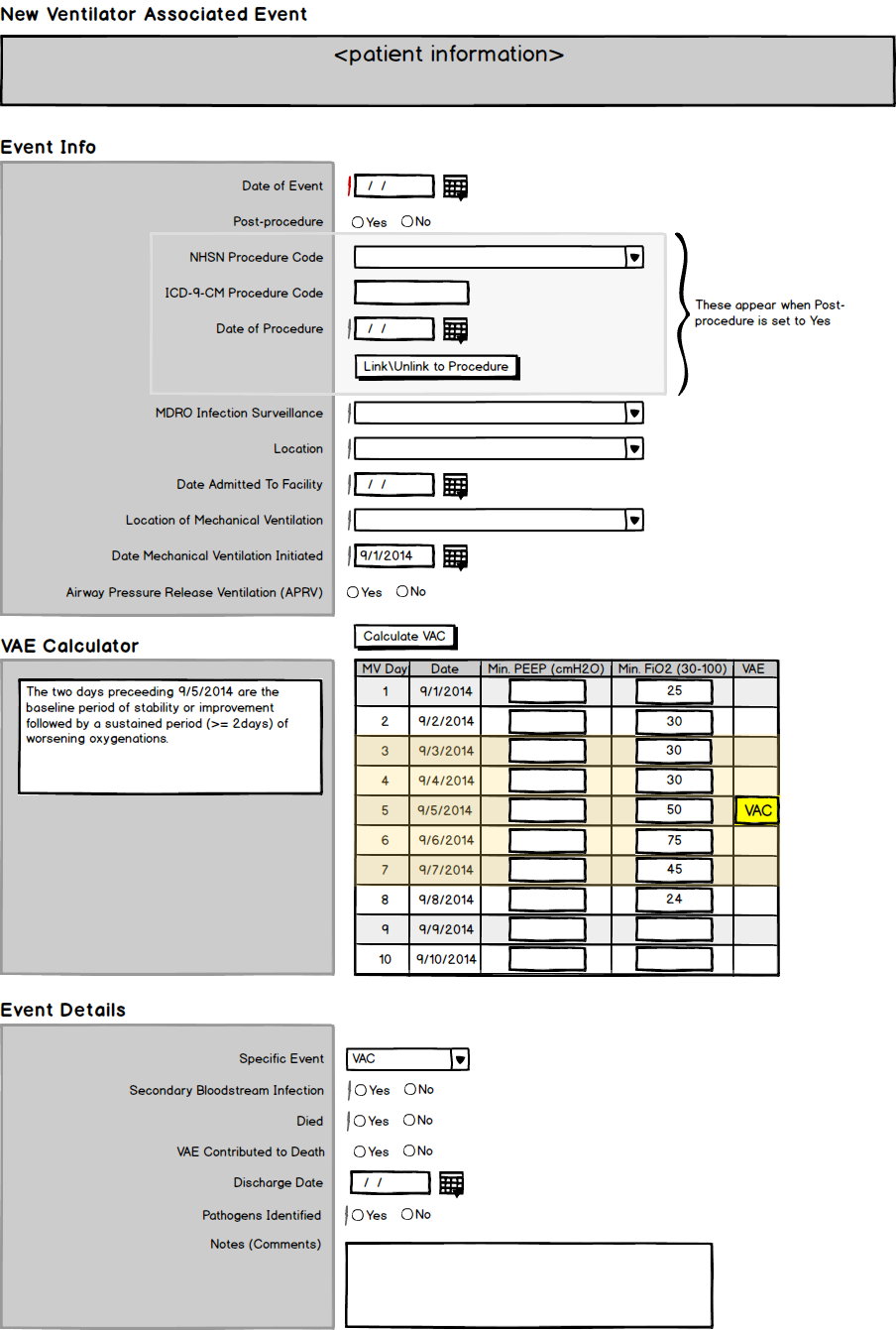
VAE form for Sentri7


Project Overview

Pharmacy OneSource is owned by Wolters Kluwer and provides numerous SaaS products that empower clinicians to improve outcomes at the point of care. Along with real-time surveillance of all the hospital's systems, the Sentri7 product produces reports and documents for the Center for Disease Control's (CDC) National Healthcare Safety Network (NHSN) reporting of pathogens. What a hospital wants to do is show that a pathogen was not acquired at the facility (Hospital Acquired Infection or HAI), but was already present at admission (Community Acquired Infection or CAI.) This can be very tricky when patients are put on ventilators and the CDC has a very specific protocol that specifies what qualifies as an HAI or CAI and how this is to be reported. The objective was to take the current protocol and create a form that could be digitally sent to the CDC for NHSN reporting. This form would contain logic that would determine the type of Ventilator Associated Event (VAE) and then create the correct form to be submitted.

Challenges

The CDC will often update their requirements as often as every 6 months, so the forms need to be dynamic and capable of backward compatibility for up to a year. The requirements for specifying a VAE are so convoluted that the CDC has actually created an online application that helps nurses and respiratory therapists figure out what sort of report they need to fill out.

Process

Become a VAE expert

I read all the documents that the CDC supplies around VAE reporting. I interviewed our subject matter experts at Pharmacy OneSource. I then conducted 8 client interviews to determine how they reported VAEs and to gather Voice of Customer (VoC).  I also gathered data on the type of ventilators they were using and if data was being collected from them and at what frequency.

Map out the process

Once I had all my data collected, I worked it into flow charts and created diagrams that outlined the process of determining the type of report we would need and the data required to fill that report. Further analysis revealed that a very short path could be made that quickly specified the type of report. I then took this to the SMEs and clients to vet its validity. 


Create a mockup

Based on the data, a wireframe is created in Balsamiq Mockups that matches the Sentri7 look and feel as well as the data requirements. This is again vetted with the SMEs and select clients to determine validity and comprehension. This is a very iterative process and the various mockups are tweaked and adjusted. Axure RP is also used to create more interactive prototypes to help with the vetting process.


When are we done?

The iterative process can literally go on forever, so it is important to know when done is DONE.  Done is when the prototype successfully accomplishes the objective we set for it.  In this case, it was to be able to create the correct digital form to populate and send to the CDC for NHSN reporting. This also needs to take into account fringe cases and instances that do not need to be reported.


Project Overview

Bock Water Heaters was looking for a way to differentiate themselves from their competition. They wanted to show what it was that made their flagship product, the OptiTherm, best in class. They also wanted to appeal to a younger generation of facility engineers in a way that would stick in their minds and place Bock far apart from the competition. I was asked to put together an experience that would communicate the benefits of the OptiTherm in a way that had not been done in this industry before.

Breaking the Ice

Virtual Reality is something that is hard to describe. It is something that needs to be experienced first hand and often leaves the user completely blown away. When I talk about VR, I am talking about 6 degree of freedom VR that is driven by a powerful computer and not mobile VR that consists of putting your smart phone into a viewer. For my introduction to the senior staff of the company, I needed to show the power of VR and what we could do with it.

I obtained a 3D solid model of the water heater from their engineers and quickly converted it to a usable mesh and reduced the poly count to a manageable size for my real-time 3D engine. I dropped the model into my VR sandbox environment and gave it a light blue material finish. I also added part of the blower assembly to the room, but made it 10 feet tall so that we could walk around it and inspect it closely. To demonstrate how impactful VR can be, I also added a model of their Turbo-Flu just outside of the room, but enlarged it to 40 feet across and a few hundred feet deep. I also added a catwalk platform from the edge to the middle of the flu so that users could walk out and look down into the abyss. To add to the effect, I added a smoke particle system that flowed up through the Turbo-Flu.

Capture01.JPG

OptiTherm in VR Sandbox

Basic shading with minimal optimization

Capture02.JPG

Catwalk into Turbo-Flu

Adding Some Realism

A real-time environment requires the models to be optimized. VR has a target frame rate of 90 frames a second so reducing the poly count is paramount when creating a compelling VR experience. I took the 3D model that was broken down into over 300 discrete parts and culled it down to a more manageable lot. I also colored and textured the parts to reflect what they looked like in real life even down to the screws on the case. The result was a very compelling virtual reproduction of the water heater that the user could experience in Virtual Reality.

Making a Mobile Version

The client wanted to get the VR experience out into the hands of all their sales reps so we decided to create a mobile VR version. The solution was to create a 360 panoramic video using a virtual panoramic camera from within Unity. The camera was animated and the video was created. Scenes were cut together and a voice over describing the experience was added using Adobe Premiere Pro. The resulting video was loaded onto an Android based all-in-one VR goggle for optimal playback.

Moving to AR

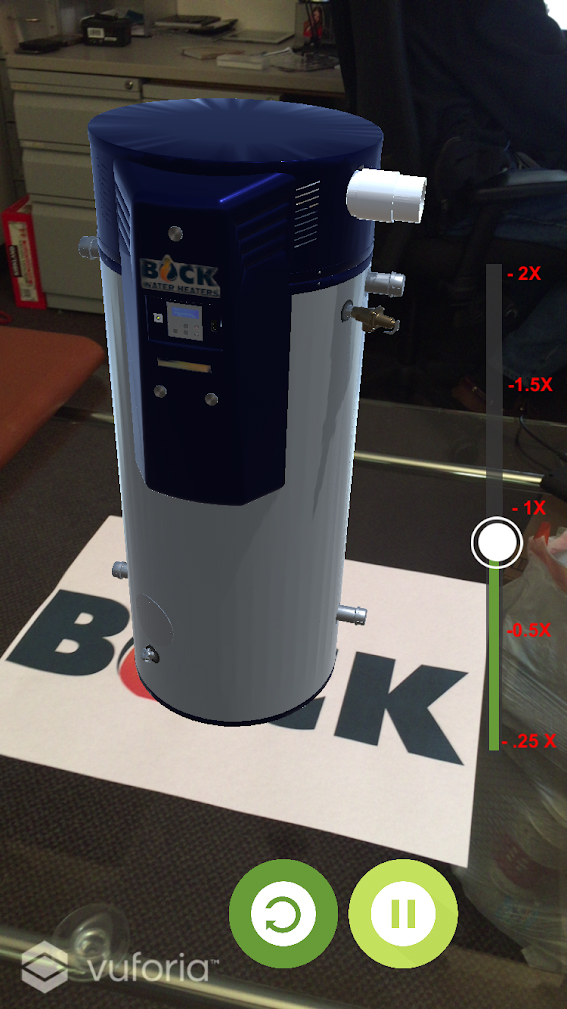
To create an experience that everyone could enjoy, we developed an Augmented Reality app for iOS and Android that showed the OptiTherm assembling itself. The user could move their phone around like a camera and view the animation from any angle they desired and learn about the OptiTherm. I utilized some of the advanced tracking features of Vuforia to persist the water heater even when the target was no longer seen.

Bock AR.jpg

AR Apps

The “OptiTherm” AR apps can be downloaded in the Apple App Store or the Google Play Store. The target can be printed from this link.

Conclusion

What started as a Virtual Reality showcase, turned into three deliverables that were accessible to three tiers of devices. Each experience was unique but tied into the overall theme that the client wanted.